The Right Touch (Designing HUD for Mobile)
When I began my first project for iOS/mobile devices, I assumed it would be fairly simple. Just make the buttons larger to accommodate for a finger instead of a mouse, space out elements a bit more, and you’re done! Hoo boy, I quickly found out it’s not that simple at all.
The first project I wanted to try and make specifically for iOS was ShellBlast Forever (coming out next year). It would be a quick prototype version just to see if I could get all the elements in place and have it “work” in a mobile setting. So, I knew the HUD elements (Heads Up Display) for the game that needed to be on the screen were:
-The level layout, obviously.
-The timer.
-How many triggers are in the level.
-The number of “triggers” displayed within the beams of light.
-How many triggers the player has marked.
-How many lives the player has.
-The number of chaffs available to the user (powerups).
-A button to “cut” the wires and end the level when the player feels they have the solution.
Now, I didn’t have access to actually make an iOS game (I’m currently waiting on Game Maker Studio) but I did want to show YoYo Games a prototype of the game to see if they would be interested. I ended up just uploading screenshots to my iPod Touch to see how the layout would work on the small screen.
I had my own (completely wrong) theory on mobile game design: keep all the HUD elements on one part of the screen, and the main level on another. That way, the player doesn’t obscure components of the level with their finger. Plus, they can simply glance down at one section of the screen to get all the info they needed.
Oh MAN was this tough to do. I was trying to wrap my head around not only displaying these elements, but doing them in a way that looked pretty and at the very least serviceable to the player. And it just wasn’t working. The first draft of the game looked like this:
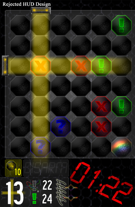
Absolute garbage. When I glance down at the bottom of the screen, I see a mess of numbers. And if I see that, then how will a person who’s never played ShellBlast before gonna think when they see a screen like that for the first time? This just wasn’t going to work.
My first mistake was trying to do style over accessibility. I was trying to tilt the timer diagonally like the PC versions do, but I was taking up valuable screen space. I knew I also needed to make it more visual, and less numbers and text. Always, always always use a picture over words whenever you can, when it makes sense. That’s something I’m always learning.
So, I first thought about what I could cut from the current HUD to cut down the chaos. I didn’t need to display how many lives the player had at all times (displayed by the cutters in the top pic), so that was out. But that was really all I could cut.
Then it was time to see what I could replace that would make more sense visually instead of numbers. I changed the chaffs to a more visual look, like the lives design. I also changed the “DISARM” button into a picture of wire cutting. I also added something I completely forgot I needed: a menu button to pause and quit the game.
Finally, I was completely unhappy with the asymmetrical layout and went with a more clean look. Everything feels like it’s in it’s proper place instead of being smushed together at the bottom. The design I currently have, but is still going through tweaking, is this one:
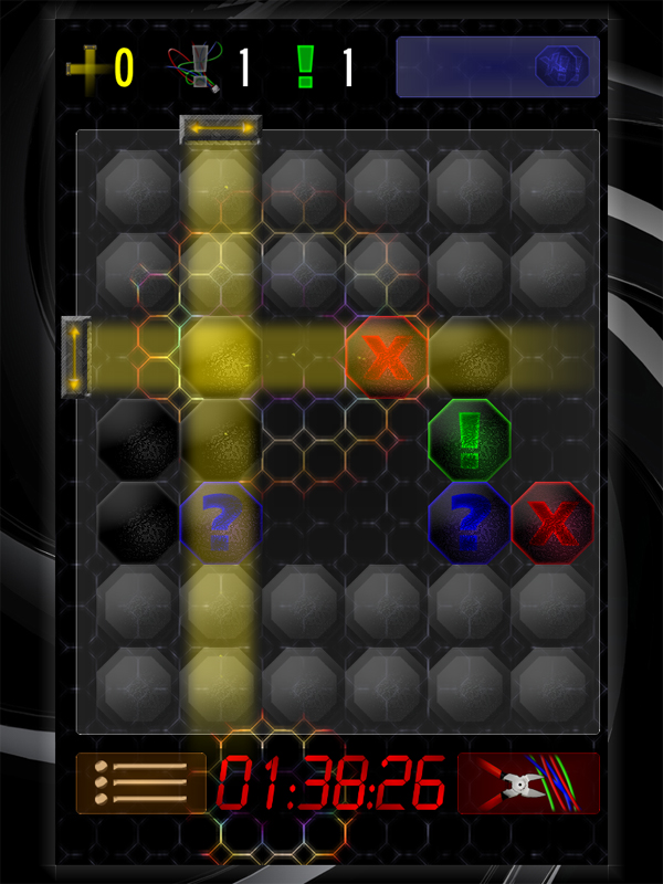
Everything seems to look better. It’s not as intimidating for new users as the old design was. And it just fits well with the iOS screen. It just goes to show how crucial it was to have a pseudo hands on experience by using screenshots to test out the design on my iPod, and to always go with a rough draft even though you have a sinking feeling it might not work, just so you know how to improve upon it.
Neptune Gasoline recently underwent a major redesign as well, and I’ll share more about that later on. But I just wanted to share how radically different it was to design on a mobile landscape instead of a PC one. Despite all the trouble, it was quite fun in it’s own way, and I look forward to seeing what my other games might look like on the small screen.
Kreativ, innovativ und engagiert arbeiten wir für Ihren Erfolg. Als aufstrebendes Unternehmen der Internetbranche hilft basemedia Ihnen, Ihr Unternehmen beziehungsweise Ihre Produkte werbewirksam auf dem öffentlichen Markt zu positionieren.
Glad to see you’re still working on ShellBlast! I hope you eventually make it work well with tablets (in which case you’ll have to consider larger screens and users who prefer a landscape layout), in particular Android. Best of luck
p.s. Oh, I just noticed your comment on the other post saying porting to Android shouldn’t be a problem.