The Oil Blue: Graphics Evolution
Way back when I first started to make the Oil Blue, I thought I’d try out the art first to see if it was possible to do it on my own…to nail a sense of atmosphere I had in my head. A ton of photoshop filters later, I finally got the look I thought would be the final graphical style of the game. But, of course, I’d be wrong.
The original idea was to have a very monochromatic color palette- maybe 12-24 colors in the game total. The original art style seemed to work for me, as it had a kind of pseudo-retro feel to it without getting completely pixelated.
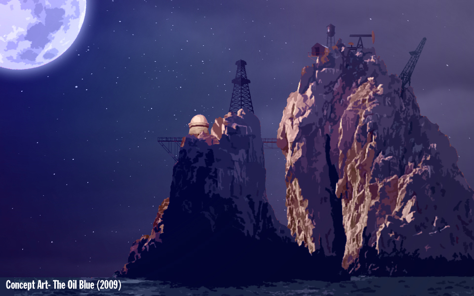
As I was porting it to Game Maker 7, I realized I was losing a lot of the fine detail from the PNG images as I was converting them to GIF images to be used. It started to look a bit ugly. Frustrated, I used a blending mode that would blend the images into the game nicely, but would unfortunately cause the images to be partially transparent and have to be nearly completely black. To cover this up, I used filters over the graphics, much like Kablooey.
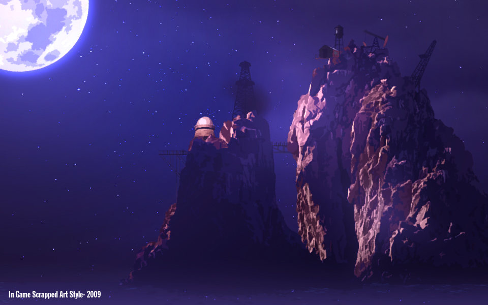
Originally the game was just going to be set on one island, with no exploration whatsoever. As the game evolved I realized how much more open I could make the world, and how users could go island to island, trying to make the abandoned works profitable again. It was a much better game flow than the original idea of, “you’re stuck on this island for life, now work your butts off to try and make millions and retire somewhere else.” The problem was much of the art I used stemmed from pictures on the internet- there was no way I could match the art style with new island shapes, mostly because I’m inexperienced, plus I forgot a lot of the filters I used (gah!). So, I turned to Sara G. who did the original Kablooey! logo and asked if she could completely redo the art. The good news was that Game Maker 8 was now released, so she didn’t have to worry about the downconversion of a highly detailed PNG sprite to a 256 color GIF like I did. This allowed for new lighting and blending effects.
Work is still progressing on the art, but as I started to import the finished sprites I knew it was an improvement. But the problem now was that my original filter and background was a bit of a mess compared to the new art style…it worked fine for the 2D-ish look I was originally going for, but now it just looked like a bit of a mess.
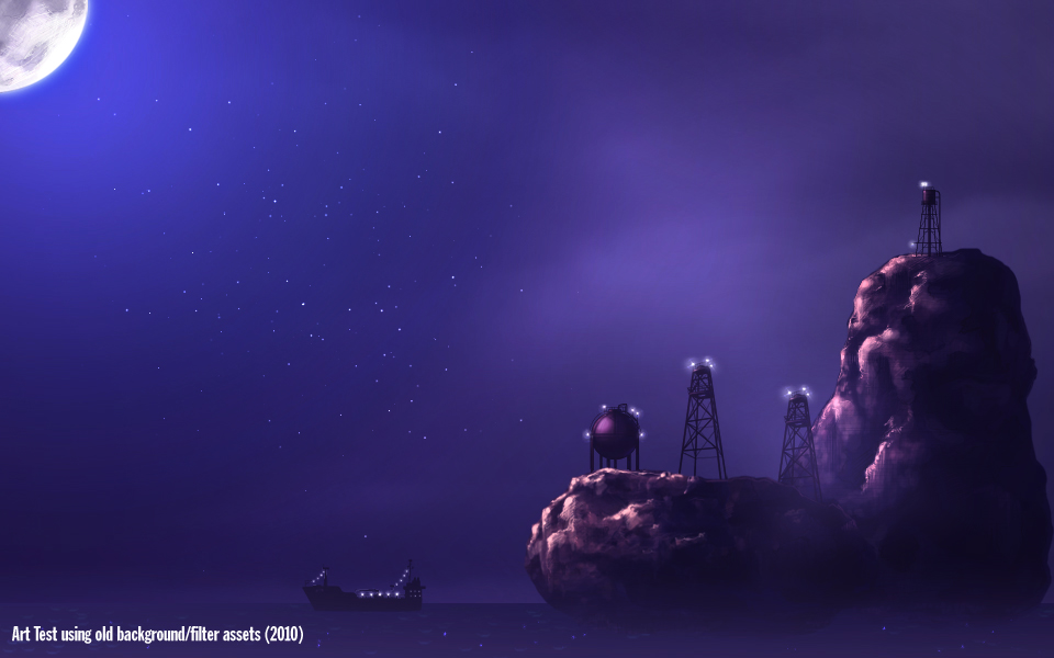
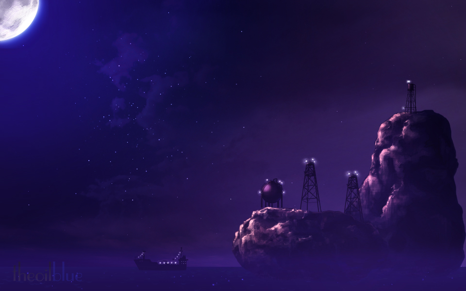
So, today I completely redid the filter and background, and added a lot more depth to both. The result is a brand new look that I’m really happy with. It’s still progressing, but I think we’ve got a great art style going here.
Just goes to show you how much the art can change from one course of the project to another…and how I should never just settle for my art style. 
Your style looked better, I think…
Both are amazing, so it doesn’t really matter.
I think the original concept art was a bit striking, but once you see the new style in-game you won’t even remember the old style.
Awesome stuff. I love checking out how game art evolves as production continues.
Lol, your style was actually pretty cool but the PNG to GIF problem in Game Maker does look like a bitch… But lucky for us we have Sara and GM8 and Mr Chubigans and therefore we’re gonna have one kickass game!