ShellBlast HD: After 25 Attempts, the Boxart is Done.
One of the main problems facing the Xbox Live Community Games market is the fact that there’s quite a bit of junk. And with no review system in place, you’re literally going by the boxart to choose which demos you want to try out.
While there have been a good amount of great games on the service, the amount of great box art can be counted on both hands. Here’s some really fantastic art:
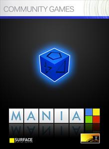

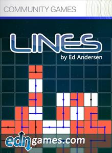
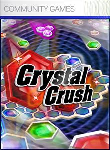
And then you have the not-so-great:
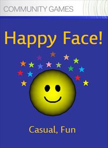
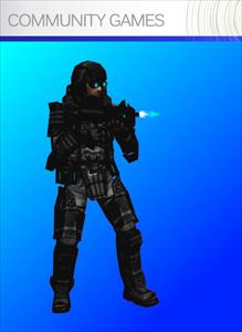
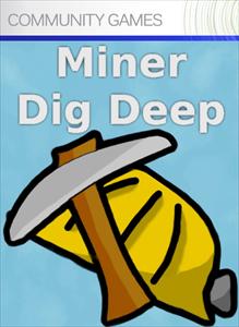
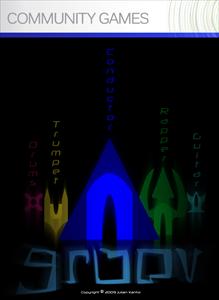
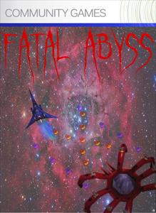
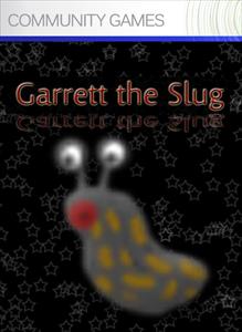
Not that any of the above are bad games mind you, but the boxart doesn’t do anything to make the games stand out from the rest. (Not that the boxart has held back any truely great games from selling, as Miner Dig Deep was in the top ten sales overall for a few weeks). So, I set out with one purpose: design a really nifty boxart for ShellBlast HD.
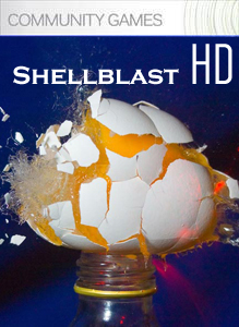
The first attempts were not all that great unfortunately:
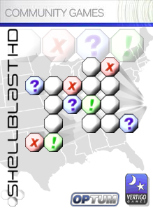
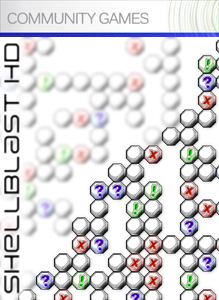
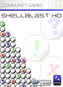
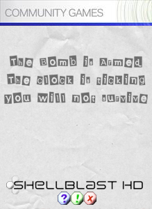
The boxart was too busy, not all that eyecatching…it was missing a visual POW that draws in the consumer. I realized I wasn’t going to be able to pull this off on my own, so it was time to post on NeoGAF, the most influential game forum on the net.
The results were quick. After posting some details on the game and my current boxart, people jumped in and gave it a spin:
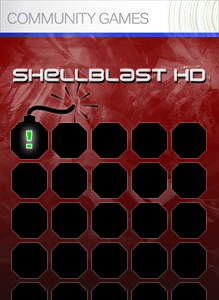
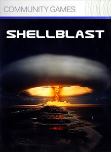
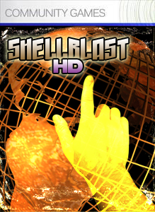
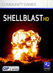
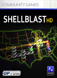
And of course some done for a few laughs:
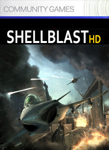

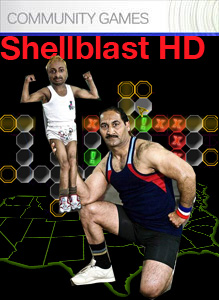
Some said that they liked the ransom note looking boxart I made, placing it on one of the pictures I posted (it’s the first boxart in this next set), so I took it further to see how that would look:
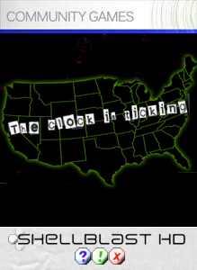
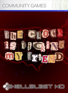
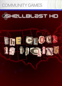
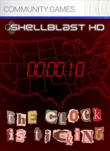
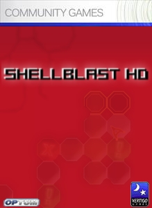
Ultimately I wasn’t feeling it. It just didn’t mesh well with the theme of the main game, so it was back to square one. But there were two boxarts done by NeoGAF users (specifically Goldrusher and McBacon) that caught my eye:


It was decided that the original logo I had for the game was too small and thin to be noticed. So, I took these two boxarts and made mockups of each:

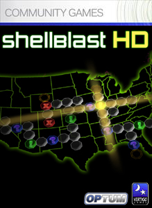
I was torn. I really didn’t know which one to use. One one hand, the black coverart looked really professional and clean. But the red coverart would likely draw a lot more attention. Then, Goldrusher had the plan of combining both into one jam packed cover of awesome. Here’s his mockup:

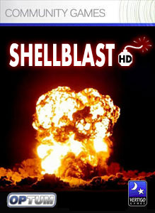
That was it…it looked perfect. So I took that and made the almost final design:

You can view a larger version right here.
So, after 25 covers and a weekend of work, the cover is nearly done (some minor logo placement and other things will be done to the art). I think it turned out really well. A big thanks to NeoGAF for all their work and hopefully you’ll see this cover in the Xbox Community Games section of your Xbox 360 in the coming weeks!
That was a very fun blog to read, for some reason.
Anyway, the end result is fantastic, and really eye-catching. I am quite excited.
Yes, very qid.
I’ve been contemplating a 360 for a long time. This might just push me over the edge.
We really need an edit button.
I kinda like the 2nd to last a bit more. The title looks a bit better w/o the blue outline and w/ the crooked HD.
It might also look nice if the edges of the bg were a bit darker. It might make it look sleeker.
Heh, that was great. Although I enjoyed cover sbox6.jpg more (the mushroom cloud over the large city), I’m really digging the design you picked as well.
Also, not having a 360 myself, what is the quality of the Community Games like? And how many quality games are there?
At the moment, there is more rubbish on the service than good. This is mainly because there is no quality control. When a user submits a game it is peer reviewed, and these playtests just check for playability and appropriateness, not how fun a game is. It is a shame because the poor titles are giving the service a bad reputation and weighing down the good ones.
Some of the games I really enjoyed are Johnny Platform’s Biscuit Romp, Weapon of Choice, Artoon and my favourite, Carneyvale: Showtime. I think these sort of games need to be pushed by Microsoft to give the service better exposure. Also, adding even a minimal amount of gamerpoints to Community Games would probably help to increase its popularity.
It was really fun to look at all those boxarts, I only saw the first and last one so seeing the process of how you got there was great David.
Awesome. The blue glow just looks out of place, my first thought of it was “what’s that blue thingy at the top of the logo supposed to be?”. It’s too visible towards the top, and anyways it might be better with no glow at all.
looks nice 😀 I love it also i love the first attempt 🙂 also its not eye catching i totally love it 🙂
I’d have to agree with Illari about the blue glow, but I don’t think it’s a big deal. It looks great, when is it being released?