The Many Faces of Ore no Ryomi 3 (finale)
So, I have shown you many versions of Ore no Ryomi. And through those versions, with each artist dropping out for their own reason, I realized something. There would be only one way of making the game: either with lots of cash to pay professional artists, or drawing it myself.
Well, cash was out of the question. So, I was set on doing it myself this time, and began work December 2007.
I knew that drawing wasn’t my best asset, but I could photoshop quite well. If I could take real-world photos and elements, I thought, perhaps I could mess with them enough in photoshop to give the appearance of a style. Around this time, I came across a few discussions about non Gamstop casinos, which oddly enough, inspired me to think outside the box. The problem with my idea was that you need the pictures to be perfect, in the right angle to use, and finding something like different layers of a hamburger was pretty much impossible. But I still continued.
The style of using real photos is also used in Liquisity 2, with better effect I think. But, I still thought I could somehow get ONR3 to fit this visual style…with one problem ahead of me: the customers. I couldn’t use real people, as that’d look odd and out of place…and I can’t really draw people.
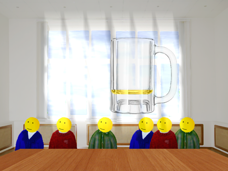
So, I decided on a simple emoticon face that would have different clothes and “props” such as hats to represent customers. It would have a unique design and get the job done well, at least I thought at the time.
<br?>
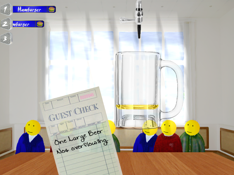
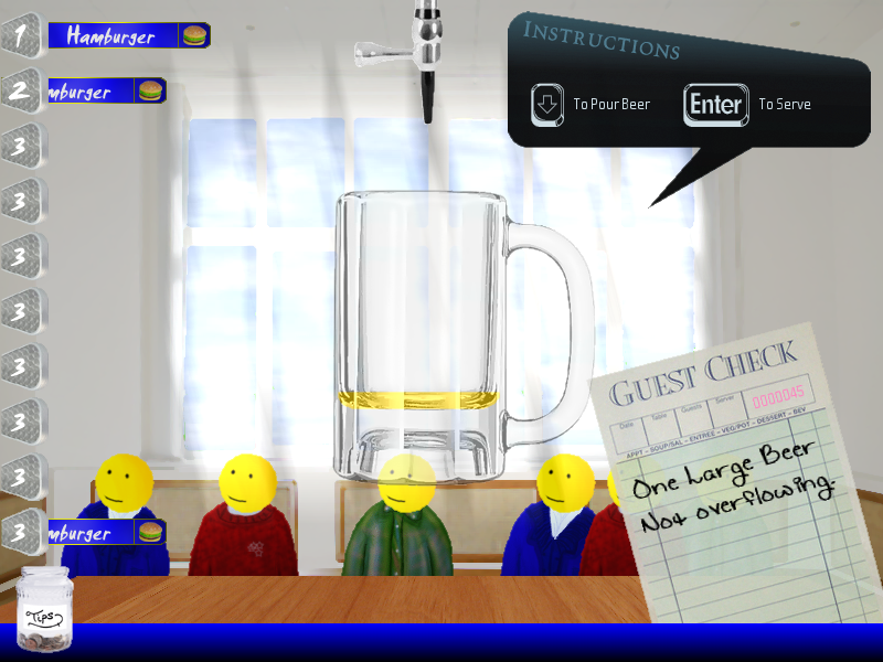
The next two pics play around with the HUD. All the text you see on the screen is actively drawn by Game Maker, so it was a mockup but it worked to a degree (as did the liquid in the beer mug). The third pic is what was going to be shown in late January.
</br?>
<br?>
</br?>
<br?>
After talking to a close friend on the internet about the pic, I took a good hard look at the final pic that was to be released in a GM mag the following month. It just wasn’t going to work. While the photo manipulation worked in Liquisity 2, that’s really because the objects themselves are so small to begin with. And so, I’ve decided not to pursue this design style.
That’s not to say I’ve given up. Over the last four years in college I’ve taken some art classes and refined my style a bit. This last week I’ve set out to try drawing the foods yet again, and you know something…it doesn’t look half bad: </br?>
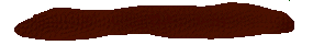
The original hamburger pattie from Ore no Ryomi 2 that I drew…
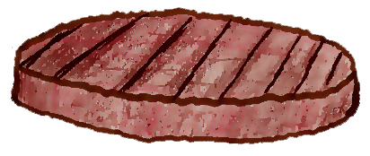
…and the new patte I drew just the other day (hand drawn and then photoshopped)
So yes, I’m continuing work on ONR3. And I will have to do it all by myself. I will not, however, release any details or screenshots until I have a working beta and all the art done. I’ve learned from the past that it’s simply useless to release details and mock up screens of a game that may never come out. So, expect nothing for a good long while on the ONR3 side.
Well, maybe one thing: ONR3 will be free. Spirits of Metropolis looks to be the only commercial game I’m doing this year. Woo!
And so ends this long series of posts on the many styles of Ore no Ryomi 3. I’m a bit curious though: what do you think of the old mockup?
ONR3 will be free?!
Joyous!
My personal favorite was JKR’s stuff.
Woo! Free ONR3!
Anyway, I like how the new patty looks, although it looks much less like something you’d get at a fast food place.
Heh, Bickering_Blonde wont be happy, you owe him a free copy of ONR3 from the VGF competition in 2005. Ah well, he’s long since gone.
Oh, damn that noexistent edit button.
Here’s my favourite to least favourite:
JKR > JABayne > Your Style > Him’s
Sorry, I really must be honest though.
Just to be clear, you’re talking about the style that I wont be using, right lost?
And I forgot about that competition thing. Oops. :p
This style looked pretty interesting.. though not very clean. Better do something else, yeah.
Did you ever consider using real photos and tracing them in photoshop? I gather from what you’re saying that you just converted them to a few colours, but I may be wrong… I was thinking that maybe using paths or something, drawing over photos could work.
But, it seems you’ve already got a style in mind. Never mind, then. =D
Get a better job to pay for an artist. How much would a good artist cost? Can’t be too much…
ONR3 free = makes my year.
“Get a better job to pay for an artist. How much would a good artist cost? Can’t be too much…”
Around $1,000 or so for the entire game. Which is $1,000 more than I have right now.
Yeah chubigans, I was talking about the style you wont be using (the photo-like style).
The new patte aint bad. 🙂
woo i am late again!!!
free!!!?? this is a good news and also your new works about drawing are good and can be successful if the game has new features and good changes. many good games do not have complex graphics!!!
but again what do you study in coledge?
I don’t think anyone knows what chubs is studying. Not that that’s a problem of course.
when will it be relased ❓ ❓ ❓