Art on a Shelf: The Vertigo Games Logo
Long live Art on a Shelf! The blog series continues today with an update of a different sort, as we leave the realm of video game design and talk about video game LOGO design!

For those who don’t know, I am the graphic designer behind the current Vertigo Games logo. Spiffy, isn’t it? Save my feelings and just smile and nod. That’s right… It IS spiffy… But seriously, I do like it a lot, and think it turned out really well. It didn’t just appear out of nowhere, though. The process of logo design is a long, complicated, and normally extremely expensive one if you hire a large firm. For example, the newest not-all-that-new Pepsi Cola logo took five months and over a million dollars to create. Just to CREATE, that doesn’t go into how much it cost to replace all the old, existing logos! But listen to me ramble on about logos like a crazy, old graphic designer, sitting in his rocking chair and yelling at the darn kids to get off his lawn. Back on topic…
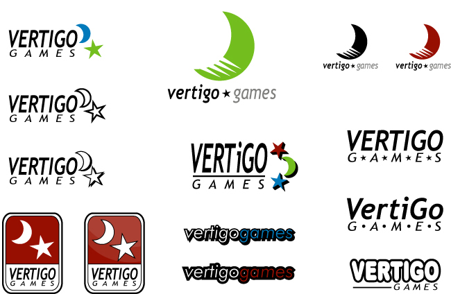
Above you can see the first round of digital logos I presented to Mr. Vertigo Games himself, David “Chubigans” Galindo. This doesn’t even show the pile of sketchbook pages I did to get to this point. These were the best and brightest of those, which is what I normally show to a client. Generally if you present too many logos (especially a lot of not-so-great drafts) it only confuses the process and slows things down. So the above are my hand picked selections for moving things forward.
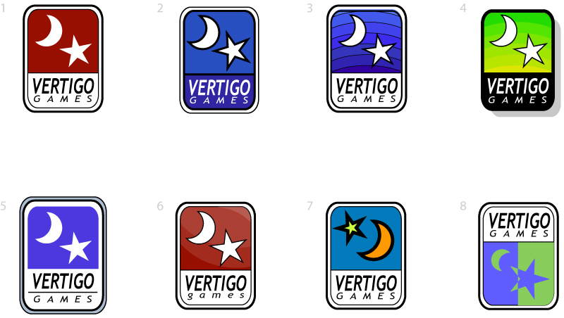
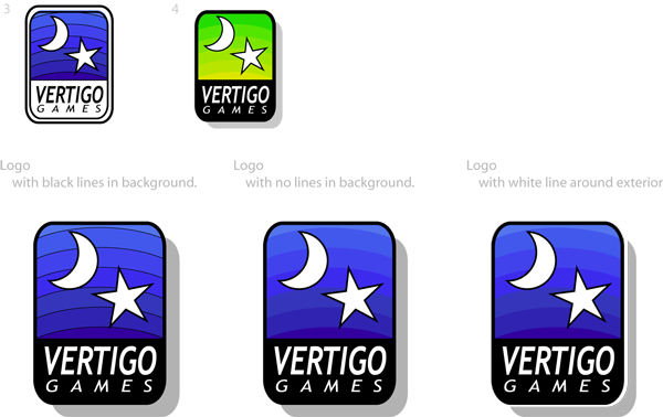
As is apparent, Chubs liked the rounded rectangle design best, so I got to work offering variations on that. Different colors, different line weights, different arrangements. Some I still really like out of this bunch, and I think they could be adapted to future projects in terms of style and design. In the end, it was decided that the rich purples and stepped gradient of logo three was the best way to proceed. The black backdrop of Image 4 was a standout favorite as well. That’s the beauty of this part of the process, you get to mash things together to see what you get!
And just like that, we had our final logo, ready to grace computer screens across the world. Best of all, since I am a freelance graphic designer instead of a big firm, it only cost Chubs $250,000 to have the new logo designed! I’m still waiting for the check, but he assures me it’s on the way. He’s assured me that for going on three years… Hmm…
So what do you think? Leave some comments in the comment section and share with everyone which are your favorites. Or stroke the egos of the management and proclaim that the official logo is by far the greatest masterpiece you’ve ever seen. Both good options.


Did you not get the 50,000 ShellBlast vouchers as payment via email JKR? I’ll have to resend them. Give me a few days.
i actually really do like that logo; it looks really slick
It could have been better… But it’s better than the first few you made!
Of course it looks good. That’s why Billy took the time to build it in Minecraft.
Outstanding! The Citizen Kane of corporate logos, right before my very eyes!
Honestly though, David and yourself definitely made the right decision. The cool blues and purples really fit well.
I love the colors but I’m not a fan of the logo design. It almost looks like a religious symbol as well, which is generally inadvisable for company representations.
@SquareWheel
I can see your point. Never really thought about that! But it’s different enough that I don’t think many would see that.
I totally like the green-to-yellow gradient a lot better. Not that I don’t like the current logo. I guess green and yellow are a tad garish, but if I had to pick I would pick the green and yellow.
Maybe it could be used for a future game that has more of a bright-colors theme to it, or a game that has a lot of green and yellow in it.
I like the current logo better than any of the “prototypes” shown here, which is sort of interesting because my feelings are usually pretty much the opposite of that.
wait no thats not interesting at all what am i saying
“Maybe it could be used for a future game that has more of a bright-colors theme to it, or a game that has a lot of green and yellow in it.”
A lot of companies do have alternate color pallets for their logos, all contained in a massive “corporate identity” document that details every last little thing about what you can and can’t do. Of course, that’s usually so other departments know what they’re allowed to use, and at Vertigo Games there aren’t a lot of other departments just yet. 🙂
[…] with homework due shortly (not my fault, I was out of town for the weekend again) so here’s a link to a blog entry I did over at Vertigo Games last week. As a stand-in for a normal one here. It’s on logo design, in […]
Nice work!
I don’t think the green and yellow really fit the moon and star image. Green and yellow are day colors.
From the first batch the rounded rectangle design was definitely a good choice. From the second batch,you guys did a good job merging 2, 3, and 4.